
I’ve done it for sentai, now let’s do one for Kamen Rider. This will only include the main riders and their main forms.
Kamen Rider Ichigo
On 1st glance, my thought is that his body looks like a ninja turtle with the shell on backward. I prefer the look of the mask on the new design but the look of the body on the old design.


Kamen Rider Nigo
Same as Ichigo except with red gloves. I like how they are differentiated with the black mask on the old design and I’m glad they are bringing it back for the Fourze X OOO MEGAMAX crossover.


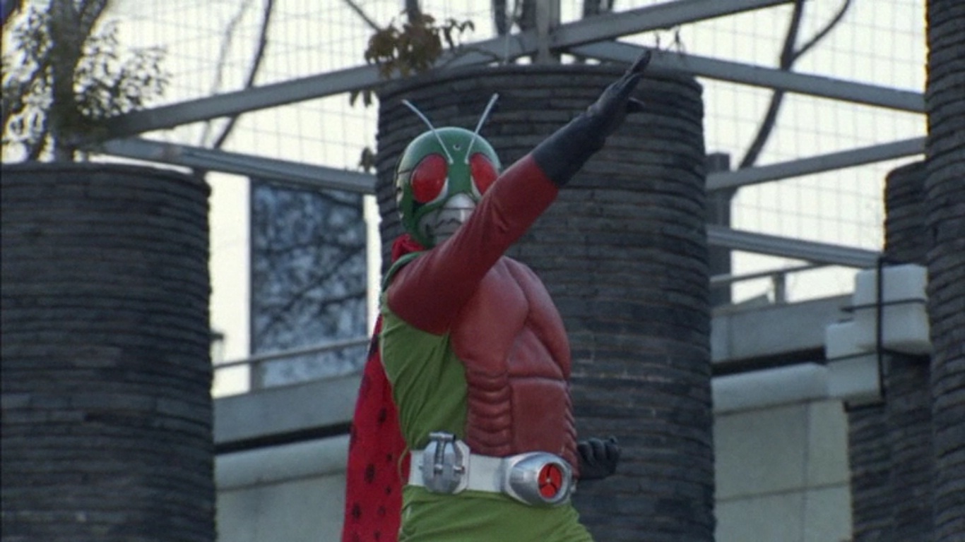
Kamen Rider V3
So much green. He also has a flesh like ribcage design on his chest. But nothing too hideous to look at.

Riderman
This rider stands out for obvious reasons. We can see his mouth. I know he is part of V3’s series, which is a good thing. I don’t think he looks good enough to carry his own series.

Kamen Rider X
Mostly a white design. And from what I’ve seen, it is a DIY henshin. Design wise, it is nice to look at.

Kamen Rider Amazon
I don’t see why people hate the design. Sure it’s a lizard or chameleon but it looks good to me.

Kamen Rider Stronger
I’ve read somewhere the S was supposed to stand for Superman but was changed to Stronger instead. Stronger is a weird name to give. Design wise, all I can say is “Grandma, what big eyes you have.”

Skyrider
Another green overdose. I know this was supposed to be a reboot of the series or something. The backward ninja turtle shell is back.
Kamen Rider Super-1
A black and silver rider with those threads hanging from his arms. I can’t think of a reason to not like the design.

Kamen Rider ZX
I don’t know how in the world they came up with ZX. It isn’t that bad until you notice the silver underwear. His helmet is also unique.

Kamen Rider Black
This guy is so popular. Interesting how they used yellow and red to compliment all the black he sports.

Kamen Rider Black RX
I know this guy as Saban’s Masked Rider. Don’t know what RX is supposed to mean. He is black with a lot of green. Very nice memories of his gold and blue forms as well.

Kamen Rider Shin
If I saw this guy by himself in a picture without a title Kamen Rider, I would not think of him as a Rider. He looks more like a B monster movie star.

Kamen Rider ZO
Super simple design. I think Toei is playing it safe with this design, nothing too fancy.

Kamen Rider J
Same with ZO. In fact, they look so much alike. Guess only hardcore fans will be able to tell them apart.

Kamen Rider Kuuga
This rider revitalized the series. His design looks pretty simple. Too simple compared to his successors.

Kamen Rider Agito
Looks like Kuuga only sporting a more gold look. Simple design as well.

Kamen Rider Ryuki
His helmet looks awesome. Such a sleek look. Though from the front looks like a ventilation shaft.

Kamen Rider Faiz
I don’t know about this one. Is it a Tron inspired look? Weird eyes as well.

Kamen Rider Blade
Looks like a knight to me. Is this the first blue Rider? Weird shaped head.

Kamen Rider Hibiki
How does this guy see? Where are his eyes? His helmet is cool and the horns are a nice touch.

Kamen Rider Kabuto
One can really see the beetle design with just a glance.

Kamen Rider Den-O
Based on trains I guess? Orange color but his bug eyes don’t appeal to me.

Kamen Rider Kiva
This is a really great design. Bat inspired. His eyes look very cool and chains on his armor just adds to the
awesomeness.

Kamen Rider Decade
Pink! Just kidding, they say it’s magenta. This rider is infamous for having a bad series but I like design.
Barcode head.

Kamen Rider W
After all the complicated designs of his predecessors, W goes back to simplicity and he looks great. Green and black makes a rider look good.

Kamen Rider OOO
Needless to say, I love OOO’s design. Sure it’s a traffic light but it really meshes well together.

Kamen Rider Fourze
I don’t hate it but I also don’t love it. Space rocket and Playstation themed.

No offense but Kuuga was one of the best designed armor there. Paying tribute to the old classic look, while at the same time making it modern, with it's own unique take. Its theme is was supposedly an ancient armor from past times. Which is totally what it could be, thats what so great about this design. Its pretty much timeless. Unlike some of the other armors, which feels too complicated or confusing. Honestly you don't give Kuuga too much credit. Considered it help jump start and revive the series in a big way. With its amazing story and solid costume design. Being a critic is more then just trying to always trying to find something bad to say about something. Thats just cut, dry, and swallow. Amateurish really. Giving credit wheres credits due, and understanding the material before making gibberish remarks, is part of what makes a true critic. But I guess you have little understanding of that.
ReplyDeletegaim suits are ugly. curse the designer
ReplyDelete